0 → 1 PRODUCT SPRING 2026
Pax
A robot companion and an app that help older adults get through an airport on their own.
ROLE
UX research, interaction
design, prototyping
TEAM
Amanda Yu, Hannah W, MJ Byun
TIMELINE
10 weeks
METHODS
Expert interviews, concept testing,
moderated usability, Sean Ellis PMF
HERO IMAGE · PAX IN AN AIRPORT

TEN WEEKS, FIVE PHASES
Ideation
Topic
Brainstorm
Personas
Research
Expert interviews
Prototype mapping
Develop
Storyboards
Concept testing
Define MVP
Build prototype
Recruit
Testing
Usability testing
Analyze results
Product-market fit
Result
Report
Present findings
THE PROBLEM
Getting through an airport is rarely one big problem. It’s a lot of small ones in a row.
AIRPORT · SPECIAL ASSISTANCE DESK

11M
Americans over 65 living with a travel-limiting disability
Over 11 million American seniors live with a travel-limiting disability. Signage is hard to read. A gate change gets announced but not heard. The walk turns out longer than expected. Any one of these is manageable on its own.
Right now the answer is another person: a wheelchair attendant, a family member, someone at a desk. It works. It also means not doing the trip yourself.
HOW MIGHT WE
How might we reduce the compounding cognitive and physical friction of long-distance travel for seniors with health constraints, so they can experience the world by themselves?
MY ROLE
We shared the work three ways.
Three designers, no PM. We all ran interviews, tested concepts and worked on the app together, so most of what follows is team output. Where something was mine, I have said so.
Shared across the team
All three of us ran expert interviews and moderated usability sessions. I interviewed a product lead working on healthcare access in Africa, and worked on the screener and the affinity synthesis with Amanda and Hannah.
Also shared
We designed the app together in Lovable and reviewed each other’s screens. Onboarding and wayfinding are the flows I spent the most time in.
What I took on
The competitive teardown against Unitree Go2, Loona and Sony aibo, and the argument for where the MVP cut line should sit.
RESEARCH
We talked to three experts before designing anything. All three told us to keep it small.
—
Control the information
Hiding things doesn’t lower the effort. Putting them in order does.
—
Plan for the messy cases
Crowds, delays, a dead battery. That is where people decide whether to trust it.
—
Predictable beats clever
Experts cared more about Pax behaving the same way every time than about what else it could do.
—
Let people choose how much help
How much support Pax gives should be the traveler’s setting, not ours.
Three personas, and the one we missed

Micaela Robinson
16 · Memphis, TN
“I want my grandmother to go wherever she wants, without needing me.”
FRUSTRATION WE USED
"Accessible" routes that end at a broken elevator or a high curb.
WHAT IT CHANGED
Real-time barrier mapping went into the concept set. Her remote-monitoring need did not survive the MVP cut, and that call is in section 06.

Arthur Hayes
74 · Florence, IT
“Losing the explorer would feel like losing myself.”
FRUSTRATION WE USED
Early macular degeneration, plus sensory overload in crowded terminals.
WHAT IT CHANGED
Large high-contrast type and one task per screen. It is also why Pax buffers a crowd from the side instead of leading from the front.

Margaret Ellis
68 · London / Valencia
“I don’t want help. I want systems that make help unnecessary.”
FRUSTRATION WE USED
Medication timing tied to flight delays, and the physical load of carrying medical devices.
WHAT IT CHANGED
The 10–15 lb carry requirement, and real-time delay information as an MVP feature rather than a nice-to-have.
THE FULL BOARDS
Each persona has a full board behind it — behavioral scales, needs, goals, motivations and influences. Open one to read it.

MICAELA

ARTHUR

MARGARET
What we got wrong
Micaela is the caregiver. The person she is asking us to help is her grandmother, and we never made a persona for her. Arthur and Margaret ended up carrying all the primary-user needs between them, and our early concepts leaned toward remote monitoring, which the MVP later cut.
CONCEPT SELECTION
We voted for wearables in Crazy 8s, then built a robot instead.
Every wearable idea added one more thing for the traveler to wear, charge and figure out. The experts had just told us to reduce what people have to manage. A companion that walks ahead of you takes the work off the person instead.

CRAZY 8s · SHEET 1
CRAZY 8s · SHEET 2

MICAELA STORYBOARD
Three moments, and what we chose to prototype
We mapped the journey into awareness, support and service experience, then listed every idea that could shift each one. Most did not survive: solar power, health broadcasting to bystanders, launch-event marketing. What made the MVP were the three that changed the walk itself — onboarding, behaviour language, and an interface built for low vision.

Prototype Mapping worksheet, IDEO Design Kit · team exercise
05 — FORM AND BEHAVIOR
How do you tell someone to follow you without speaking?
Pax walks slightly ahead, carries up to 15 lbs, and folds down small enough to take on a plane. The harder problem is behavior: it has to read as a guide rather than an obstacle, slow down without seeming to give up, and stay legible to someone with declining vision in a crowded terminal.
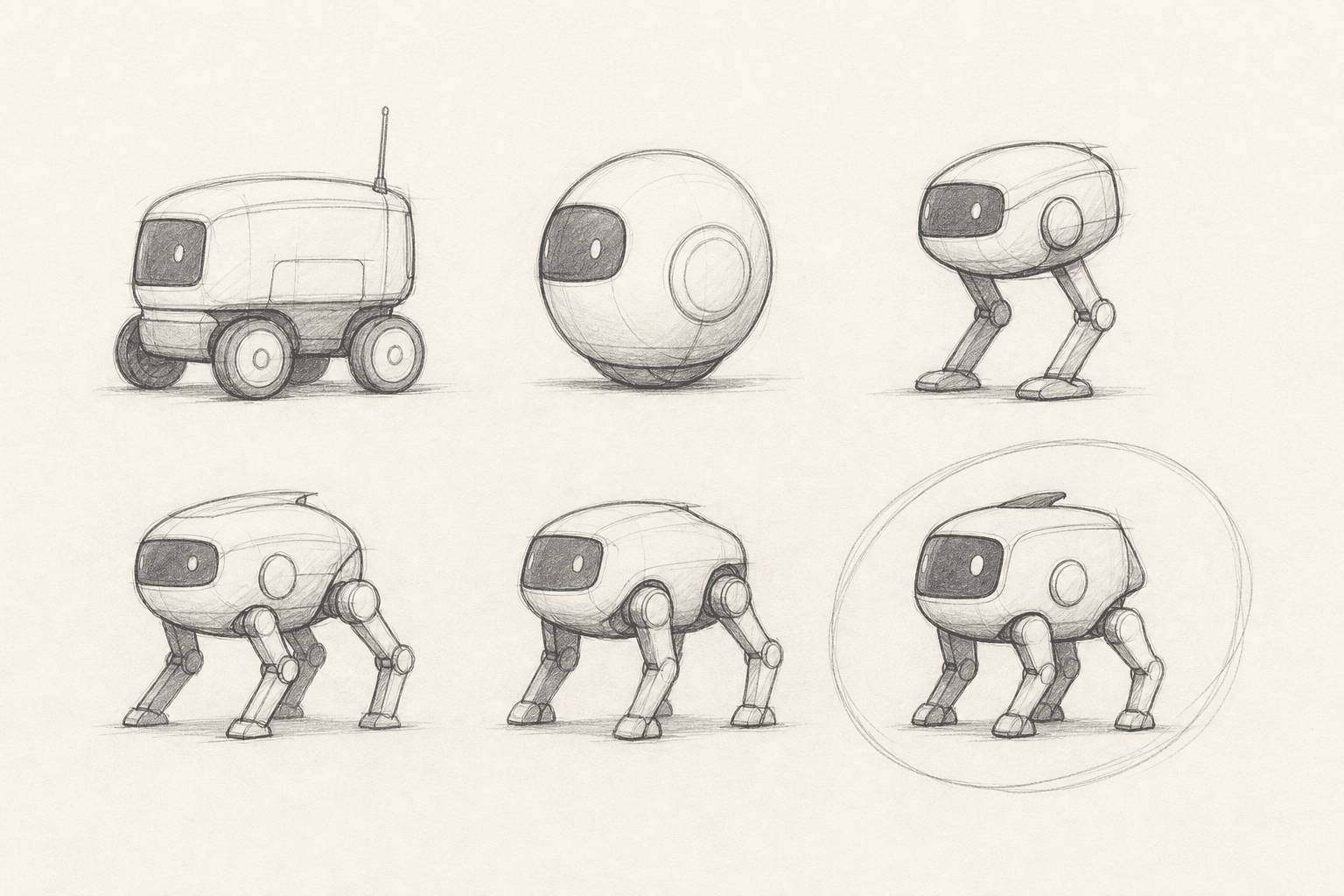
FORM STUDY

SCALE VS. TRAVELER
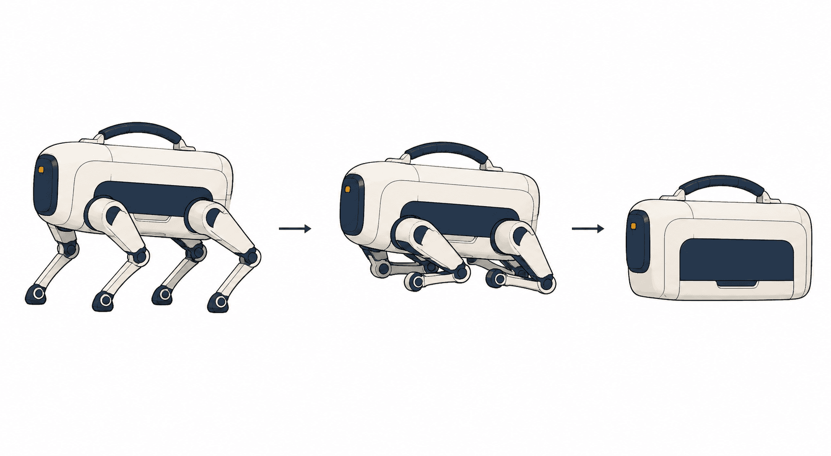
FOLDED / CARRY
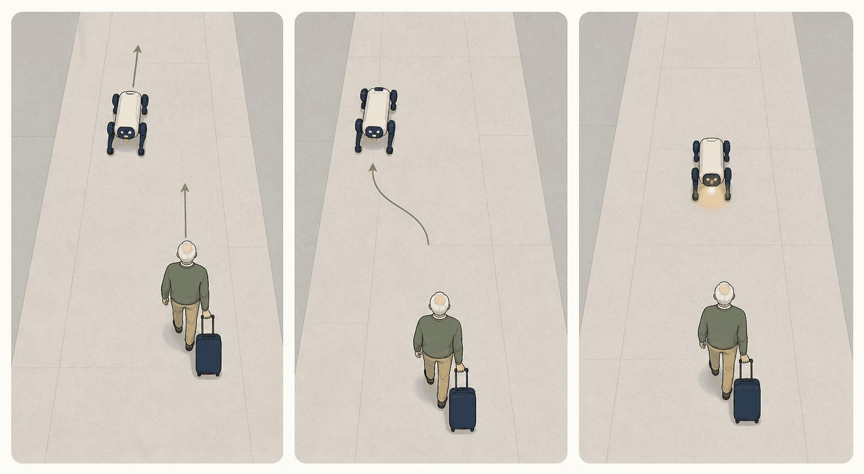
BEHAVIOR: SLOW DOWN
THE MVP
We cut it down to three things.
Unitree Go2 moves well but is built for industrial work. Loona has personality and can’t carry anything or handle a public space. Sony aibo is company rather than help. Pax is the one that does something useful and still treats you like an adult.
NAVIGATION
Voice directions with simple arrows. Pax walks slightly ahead and matches your pace.
ACCESSIBILITY
Large high-contrast type, one task per screen, and a chassis you can fold and carry.
SAFETY
Emergency contacts, anti-theft alerts, and a check that you are still on route.
LOCATION

PAX IS HERE
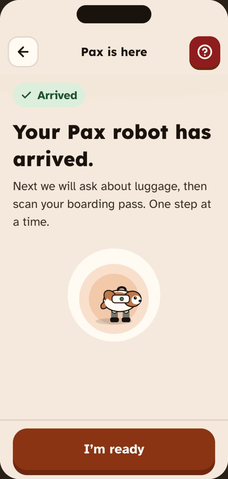
Flight Ticket
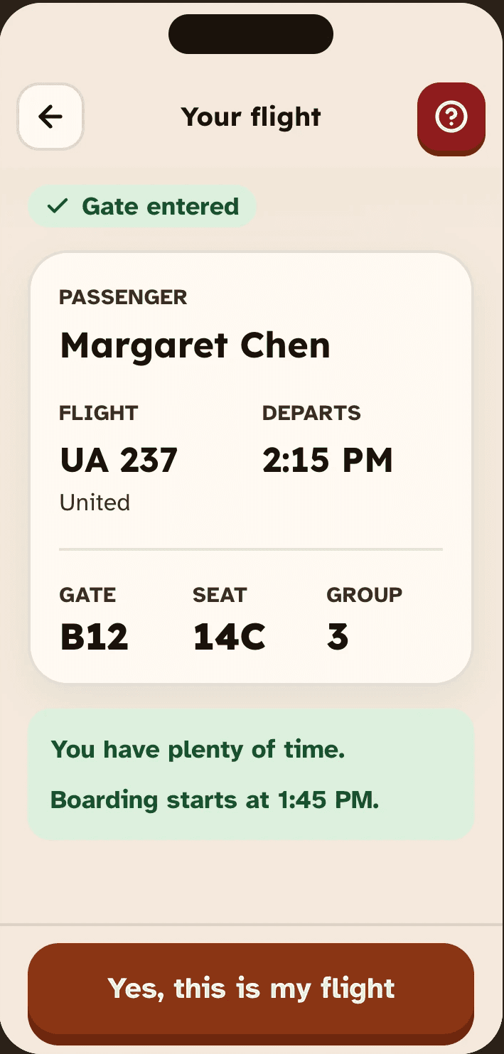

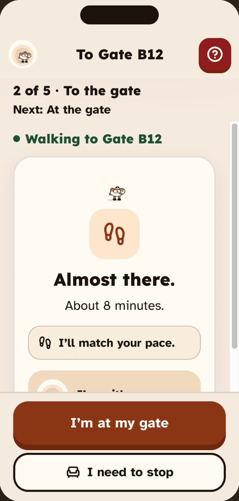
ON THE WAY
FINDING PAX

Finished Finding

07 — USABILITY STUDY
What you'd build next
Six 30-minute moderated sessions over Zoom, think-aloud, recruited through a Google Form screener. We asked people to onboard, find their gate, and find somewhere to sit and eat.
6
participants
3
core tasks
4/6
found it helpful
3/6
hit a CTA problem

What broke, and how we would fix it
01
The rest button was invisible
None of the six noticed “I need to rest.” Grey on cream looked like a disabled button, and it went away once the journey ended.
THE FIX
Give it a solid fill at AAA contrast and keep it available for the whole trip.
02
“Not now” went nowhere
Declining location permission did nothing at all. The app just sat there.
THE FIX
Change it to “Decline and exit”, or ask again before the next step. Handle the refusal.
03
Two tasks arrived at once
“While you wait, scan boarding pass” appears while the robot is still on its way. Cathy wanted to wait for the robot first.
THE FIX
Put the steps in order. Each one finishes before the next appears.
04
The live map confused people
People couldn’t place themselves on the concourse map or tell which landmark was tappable.
THE FIX
Show the next turn first. The map becomes something you open, not the default view.
05
Body text was too small
Instructions ran long and dense at default sizes, for a group with declining vision.
THE FIX
18pt minimum for body copy, one clear action per screen, and long instructions broken into steps.
08 — PRODUCT–MARKET FIT
A prototype people liked, from a survey that couldn’t tell us much.
14.3% very disappointed, against a 40% benchmark.
We ran the Sean Ellis test with 14 people, each shown the prototype before answering. Pax did not hit the benchmark. What we did get was a large middle: 57.1% said somewhat disappointed. That reads as people who like the idea and don’t trust it yet.
Very disappointed
14.3%
Somewhat disappointed
57.1%
Not disappointed
28.6%
2.36 / 5
was how hard people rated finding travel information without Pax. The Sean Ellis score is low because the problem Pax solves did not feel pressing to this group.
Why this number is soft
Our sample was mostly students and designers, not the older travelers Pax is for. Re-running it with the target group is the first thing I would do.
What people actually wanted
Real-time itinerary management
12 of 14
Local recommendations
12 of 14
Safety and emergency features
10 of 14
Offline access to information
10 of 14
Budget tracking
10 of 14
The survey measured a travel app, not Pax
All 14 respondents ranked the same five features. Two of the top answers are things a wayfinding robot has no reason to do.
All 14 ranked local recommendations and itinerary management at the top, ahead of safety and offline access. Restaurant tips and expense tracking are travel-app answers. The two that map to what we built came fourth and fifth, which told us we had asked the wrong question.
WHAT THE SURVEY TOLD US TO BUILD NEXT
Accessibility is the feature pack
Adjustable text size, high contrast, mobility-aware routing, a needs profile set during onboarding. Two people asked for this unprompted and the open answers backed them up.
Scope it to the airport
Every situation respondents described was airport-shaped: finding a gate, orienting in an unfamiliar terminal, getting through transit without the stress. General travel never came up.
Hold the pricing question
Willingness to pay tracks trust, and trust here tracks whether the information is right. Real-time accuracy and an offline mode come before any price test.
09 — REFLECTION
What I’d do differently
Don’t loosen the screener
Recruiting was slow, so we relaxed the criteria partway through. Every number after that inherited the problem. Next time the screener stays and the schedule moves.
Design what happens when people say no
Every failure we found came from someone declining a permission, needing to stop, or doing things out of order. Nobody had trouble with the main flow.
We were the wrong people to design this
None of us have the eyes or the bodies we were designing for. The expert interviews helped. Having an actual participant in the room from week one would have helped more.
Six people tested it. Five things broke, and we know how to fix each one.
Pax Travel Companion · Amanda Yu, Hannah W and MJ Byun · CCA MFA Interaction Design, 2026 · mjbyun-design.site

" height="12.816907875414387px" id="fYeRjlXmP" transform="translate(36.912 69.183)" width="40.088030377713096px"/><path d="M 0 0 L 12.317 0 L 12.317 12.817 L 0 12.817 Z" fill="rgb(255, 255, 255)" height="12.816907875414472px" id="khFTrrbQu" transform="translate(24.614 30.753)" width="12.316901122087131px"/><path d="M 0 0 L 12.317 0 L 12.317 12.817 L 0 12.817 Z" fill="rgb(132, 132, 132)" height="12.816907875414493px" id="QGGL_1pfN" transform="translate(49.229 0)" width="12.316901122087103px"/><path d="M 61.526 0 L 61.526 64.024 L 49.229 64.024 L 49.229 12.797 L 36.912 12.797 L 36.912 0 Z M 24.614 0 L 24.614 12.797 L 12.298 12.797 L 12.298 64.024 L 0 64.024 L 0 0 Z" fill="rgb(255, 255, 255)" height="64.0240822644526px" id="xNzJPZUEZ" transform="translate(0 17.956)" width="61.52640046394538px"/></g></svg>)