
✦ LUMA · PRODUCT DESIGN · 2026
Role
Interaction design lead —
onboarding, Event Buddy,
post-event flows, design system
Tools
Figma, Figma variables,
FigJam
Team
Christina Valdivia
Naveet Vaid
Minjun Byun
Timeline
Summer 2026
THE SHORT VERSION
BEFORE
What kind of room am I comfortable in?
Onboarding · Completion portrait · Event tags
DURING
I’m here alone — who do I talk to?
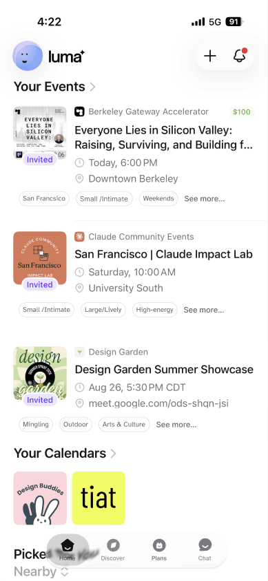
Event Buddy · Plans · Chat
AFTER
That was good. Now what?
Reconnection · Recently Met · Plan Together
FINAL ARTIFACTS
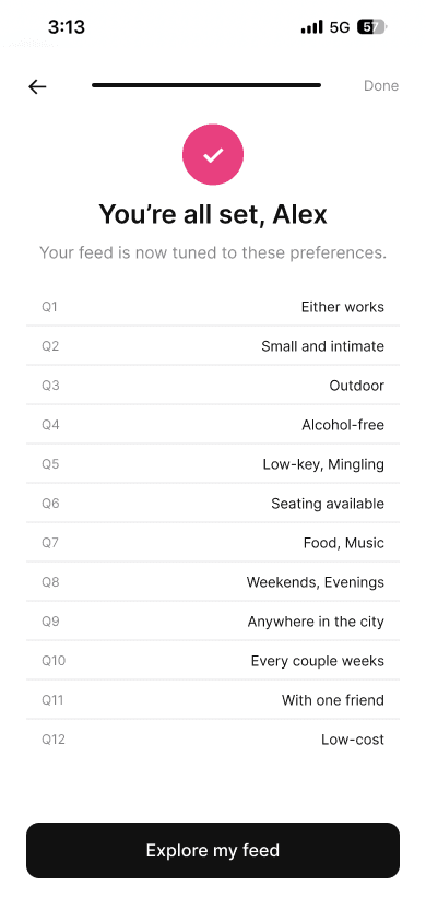
Before · Onboarding — learning your own preferences


During · Event Buddy — SMS to in-app chat


After · Post-event reconnection


THE PROBLEM


After the event
Luma has no screen here.
The product ends at checkout.
WHY IT MATTERS
30–50 hrs
Hall, 2018
1 in 3
adults in the U.S. feel lonely. One in four have nobody to lean on.
CDC
26%
of people know most of their neighbors. 12% know none of them.
Pew, 2025
The Surgeon General says being dis-connected is as bad for you as smoking every day.
U.S. Surgeon General
WHERE THE MARKET STOPS
Stage
Who does it well
Who fails
Verdict
Discover
Meetup, Eventbrite, Posh
—
Solved
Match
Timeleft, 222, Pie
Bumble BFF (1:1 swiping)
Solved
Meet
Timeleft, 222, Pie
Eventbrite, Posh
Solved
Meet again
Heylo (existing groups only)
Timeleft, 222, Meetup
Partial
Maintain
Nobody
Everybody
Open
Every app is good at getting you into the room. None of them help before or after.
PRIMARY RESEARCH · EVENT PREFERENCES SURVEY · N=8
4 + 4
Four preferred a buddy; four were comfortable attending either way.
Buddy pairing supports a preference, not a universal reluctance to attend alone.
8 of 8
picked food as something they want at an event.
Food/dining and weekend-evening timing both received 8/8 selections.
6 of 8
wanted an activity to do — more than open mingling (5) or high-energy (2).
People want something to do. Having a task makes it easier to talk.
7 of 8
No dedicated question in the app. Almost everyone asked for them.
No two respondents gave the same set of answers
Which questions earned their screen
Q10 · Frequency
Every couple of weeks
3/8
Q1 · Attendance style
Buddy / either — split 4–4
4/8
Q4 · Alcohol
Either is fine
4/8
Q6 · Seating
Seating available
4/8
Q11 · Accessibility & identity
21+ fine — but 7 of 8 chose something
4/8
Q12 · Cost
Willing to pay
4/8
Q2 · Event size
Small / intimate
5/8
Q5 · Vibe
Structured activities
6/8
Q3 · Setting
No preference
4/8
Q9 · Distance
Anywhere in the city
6/8
Q8 · Timing
Weekend evening — everyone
8/8
Q7 · Activities
Food / dining — everyone
8/8
Food was a shared starting point.
TEAM AND PROCESS
Navneet
Competitive analysis
Christina
Secondary research
Me
Synthesis and interaction design
How the work moved
01
Split research
02
Synthesize together
03
Test the assumption
04
Design, then audit
Where we disagreed, and who turned out to be right
INFORMATION ARCHITECTURE
Home
Upcoming events, continue a connection, familiar communities
Discover
Personalized discovery with vibe tags
Plans
Upcoming events, plans with buddies, past events
Connections (folded into Chat)
People met, small groups, event chats, familiar faces
Profile (not prototyped)
Interests, social preferences, privacy, notifications
INFORMATION ARCHITECTURE
Intended five tabs, mapped onto before / during / after
Home
Discover
Plans
Connections
Profile
BEFORE
Preference portrait. Continue a connection.
“Why it fits” on every card.
—
—
Social preferences. Identity and access tags.
DURING
Upcoming events. Familiar communities.
Personalized feed. Vibe tags on events.
Plans with a buddy.
Event Buddy. Familiar faces. Event chats.
—
AFTER
Continue a connection.
—
Past events. Reconnection.
People met. Small groups.
—
Features
BEFORE
Knowing what you want
Social preference onboarding
Twelve questions on room size, seating, vibe, alcohol, company.
You find out you are a small-room person. Nobody has asked you that before.
“Why it fits” card · not in prototype
Each suggested event was meant to state the two or three preferences it matches.
Preference profile · not in prototype
Answers were meant to live in a Profile tab, editable any time.
They appear once, on the completion portrait. There is no Profile tab to go back to.
DURING
Meeting someone so you are not there alone
Event Buddy
A push invites you to pair with another attendee before the event.
An option to arrive with someone: four respondents preferred a buddy, while four were comfortable either way.
Familiar faces · not in prototype
The event page was meant to show who you have already met.
Identity & access tags · no dedicated screen
BIPOC friendly, LGBTQIA+ friendly, quiet / sensory-friendly, wheelchair accessible.
AFTER
Staying in touch
Mutual reconnection
2–12 hours after, pick up to three people who checked in.
You can reach out with no risk. Neither of you is told unless you both choose.
Connections · not a tab
People met live in Plans → Recently Met, not a Connections tab.
The person you liked is still findable next week, not buried in a thread.
Plan Together
Turn a connection into a next event in two taps.
A reason to see someone again, which is the thing that was always missing.
DESIGN SYSTEM
Location
“City Name”
District
Theme
Tech
Food & Drink
AI
Arts & Craft
Climate
Fitness
Wellness
Crypto
Event Setting
Small / Intimate
Large / Lively
Indoor
Outdoor
Atmosphere
Alcohol-free
High-energy
Low-key
Mingling
Structured
Seating
Time
Weekend
Weekday
Daytime
Evenings
Chip scale
46 / 39 / 29 / 22 px
Five sizes of the same tag row, from event hero down to dense list.
Avatar scale
72 / 47 / 38 / 32 px
Five illustrated faces at four sizes — used for familiar faces and buddy pairing.
Thumbnails
60 / 40 px
Event imagery at two densities.
Glass Nav
267 × 52
Home · Discover · Plans · Chat, floating over content.
24
tags in five groups, matching the onboarding question set
15
screens rebuilt on one frame structure — status bar, header, body, absolute CTA
171
hardcoded fills and strokes rebound to variables, no colour values changed
25
colour tokens; nine run the entire onboarding flow

HOW IT GOT MADE

Pass 01 · Sketch
What questions exist and in what order. Paper, no interface.
The order kept changing because I had no reason to prefer one.
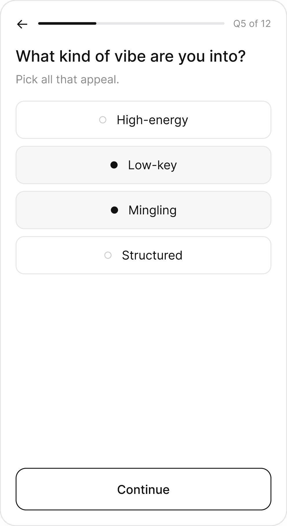
Pass 02 · Wireframe
One question per screen, progress bar, back arrow. Structure only.
Twelve screens felt long. I could not tell if that was a problem or a feature.
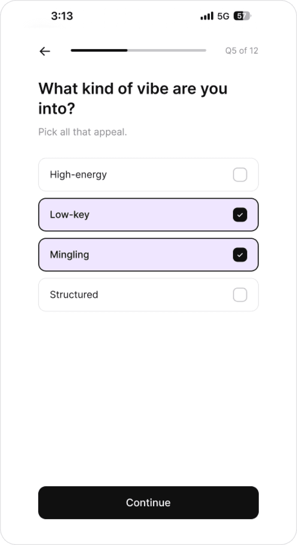
Pass 03 · Built
Real type, real tokens, selection by tint and border.
The survey showed preference variation; it did not test onboarding length.
Preference variation is evidence for personalization, not validation of twelve screens.
KEY DESIGN MOMENTS
01
Twelve questions is a lot. Is the length the problem?


What happened
Team research said five questions. I built twelve.
Why it matters
The decision
02
Which questions actually describe a person?

What happened
Why it matters
The decision
03
How should selection look in a product with no color?

What happened
Luma ships 40+ themes — then strips all of them on iOS for consistency.
Why it matters
The decision
Selected = 3% tint + black border. No accent color in onboarding.
04
Chat, or Connections?

Luma today
Three tabs: Home, Discover, Chat. No Plans, no Connections, no Profile.
What happened

Why it matters
05
Adding features to a system that was never published
Luma’s own option row

Identity tags — borrowed from category chips
Event Buddy — invented
Connections — invented
What happened
Why it matters
The decision
IMPACT AND REFLECTIONS
Prototype deliverables
3 flows, 15 screens, 24 tags, 25 tokens
Limitations · not prototyped
“Why it fits”, Profile tab, Connections tab, identity question
Would cut
Reassess repetitive questions through usability testing
Would restore
A real identity question — 7 of 8 asked, Q11 is still “who do you go with?”
What I would measure
What I got wrong
More Projects




" height="12.816907875414387px" id="fYeRjlXmP" transform="translate(36.912 69.183)" width="40.088030377713096px"/><path d="M 0 0 L 12.317 0 L 12.317 12.817 L 0 12.817 Z" fill="rgb(255, 255, 255)" height="12.816907875414472px" id="khFTrrbQu" transform="translate(24.614 30.753)" width="12.316901122087131px"/><path d="M 0 0 L 12.317 0 L 12.317 12.817 L 0 12.817 Z" fill="rgb(132, 132, 132)" height="12.816907875414493px" id="QGGL_1pfN" transform="translate(49.229 0)" width="12.316901122087103px"/><path d="M 61.526 0 L 61.526 64.024 L 49.229 64.024 L 49.229 12.797 L 36.912 12.797 L 36.912 0 Z M 24.614 0 L 24.614 12.797 L 12.298 12.797 L 12.298 64.024 L 0 64.024 L 0 0 Z" fill="rgb(255, 255, 255)" height="64.0240822644526px" id="xNzJPZUEZ" transform="translate(0 17.956)" width="61.52640046394538px"/></g></svg>)